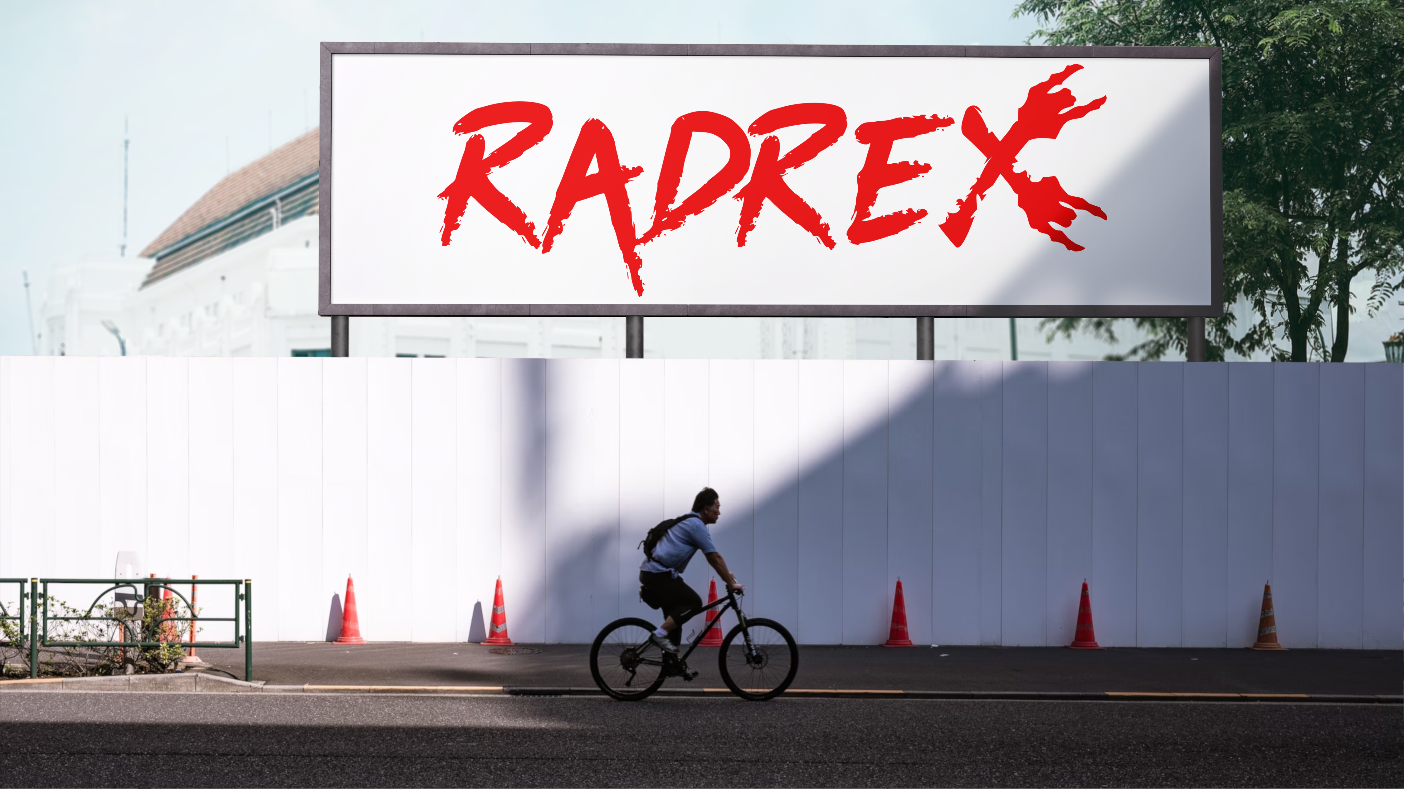
✦ Branding / web design ✦
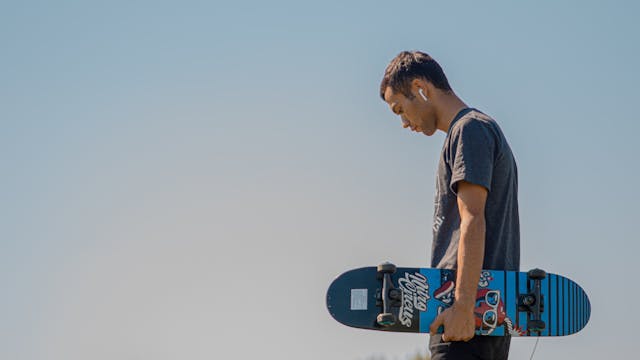
RadRex is a conceptual street-style skateboard and apparel brand built around raw energy, rebellion, and identity. The project explores how visual design can shape a brand that feels less like a product line and more like an underground movement. Inspired by skate culture, urban chaos, and high-contrast graphic aesthetics, RadRex blends bold typography, striking imagery, and aggressive color usage to create a cohesive visual system. The brand extends across skateboard decks, apparel, digital experiences, and promotional mockups—each piece reinforcing a distinct, unapologetic attitude.

The project began with defining the emotional core of RadRex: rebellion, chaos, and individuality. Instead of following trends, the focus was on creating a visual identity that feels raw and slightly unfiltered—something that resonates with underground skate culture.
From there, the approach was broken into key phases:
1. Visual Identity Development
A bold design system was established using high-contrast colors (red, black, and white), heavy typography, and graphic elements that evoke intensity and motion.
2. Product Design (Decks & Apparel)
Each skateboard and clothing piece was treated as a standalone statement while still fitting within the larger brand system. Designs focused on strong silhouettes, striking compositions, and repeatable visual motifs.
3. Digital Experience
The website design was crafted to mirror the brand's energy—clean but aggressive, with a focus on impactful visuals, minimal clutter, and strong hierarchy.
4. Presentation & Mockups
Realistic mockups were created to bring the brand into context, helping visualize how RadRex would exist in the real world—from skate parks to streetwear drops.
The goal of RadRex was to design a fully realized skateboard brand that goes beyond surface-level aesthetics
and builds a strong, recognizable identity.
This included: